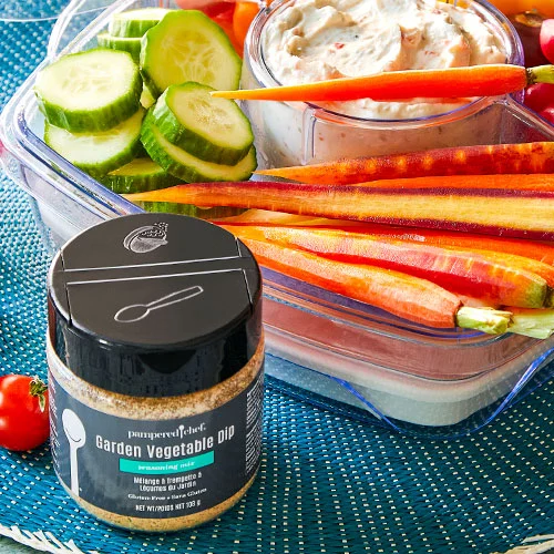
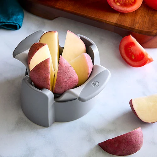
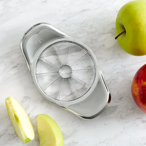
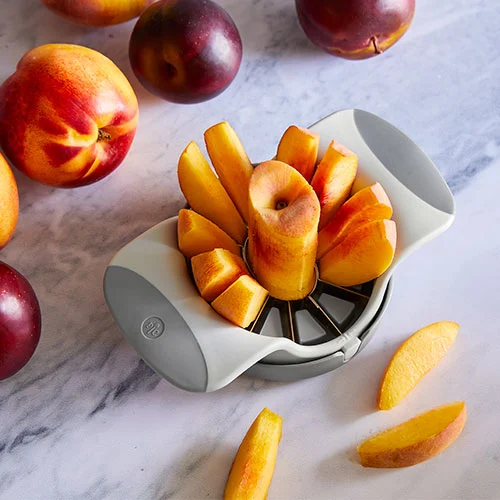
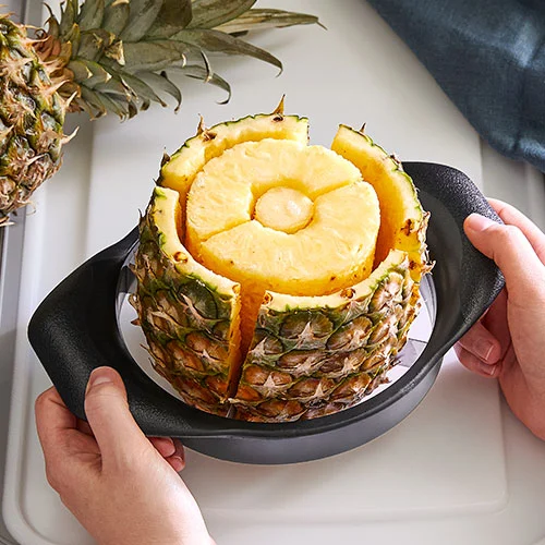
Pampered Chef's July Summer Sale was a flighted promotion that changed featured products every week, ending with a back-to-school crossover in August. Each week needed a distinct hero treatment without breaking the unified campaign identity, all rolling out on tight weekly deadlines.
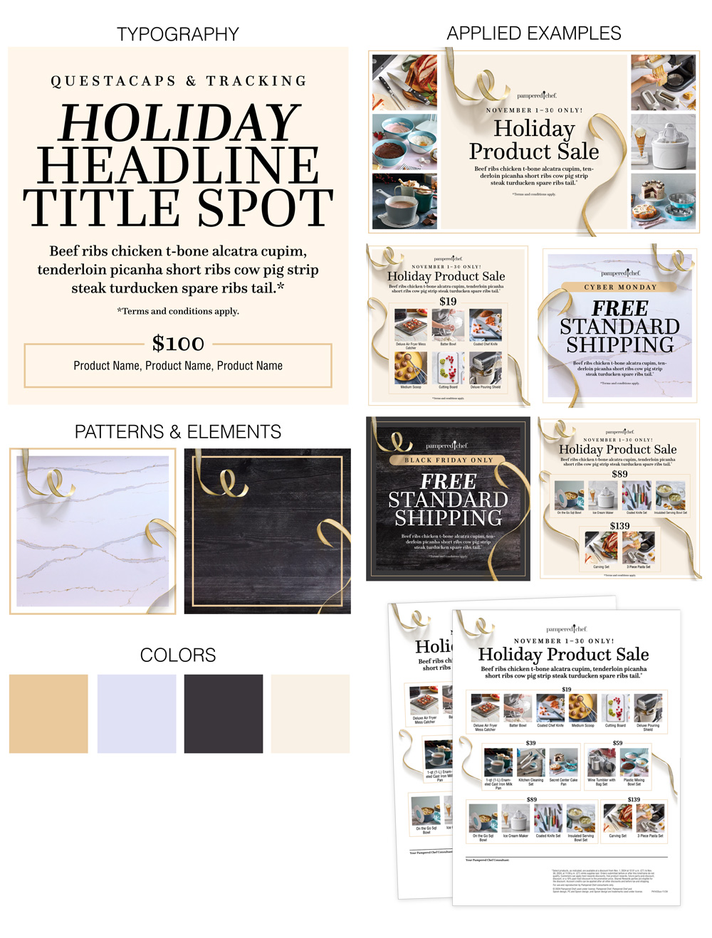
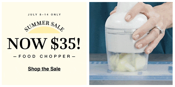
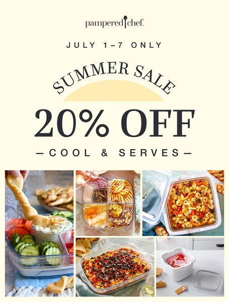
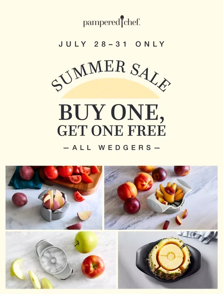
I established a shared visual language — cream background, arched "Summer Sale" lockup with the half-sun mark, Questa serif display type — then applied it across three different homepage layouts (multi-product grid, single-product spotlight, BOGO split), plus supporting social posts and a continuing late-summer banner.
The campaign read as one connected story across the July sale and the August continuation, with each weekly refresh keeping the homepage feeling alive without straying from the brand system. The shared lockup and tonal palette anchored the work even as featured products, copy, and layouts rotated.
A multi-week summer campaign at Pampered Chef rolling through July and into August. A single "Summer Sale" visual identity — cream backgrounds, the arched lockup with its half-sun, Questa serif display type — carried across three weekly homepage takeovers, supporting social posts, and a continuing late-summer promotion. Three distinct flighted moments, one cohesive system.
Each week the homepage header refreshed under the Summer Sale identity — from Cool & Serves to a single-product spotlight to a Buy One Get One closeout. Below is a live, interactive recreation of the three weekly headers, rebuilt in HTML and CSS rather than shown as static screenshots.
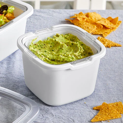
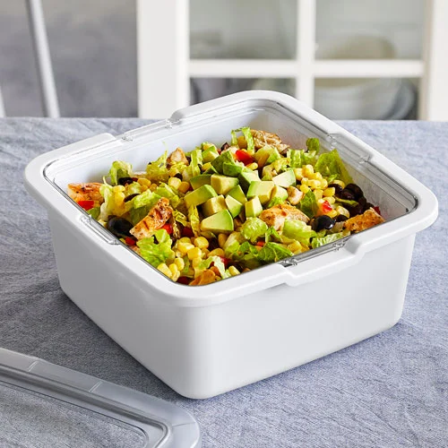
Interactive HTML & CSS recreation. Click tabs to switch between the three weekly homepage headers.
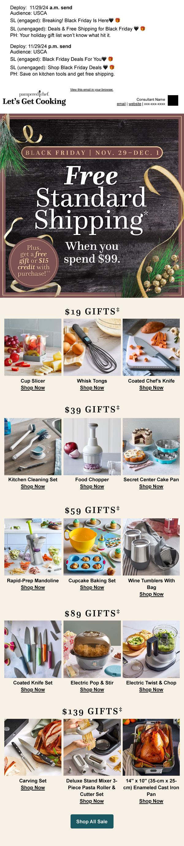
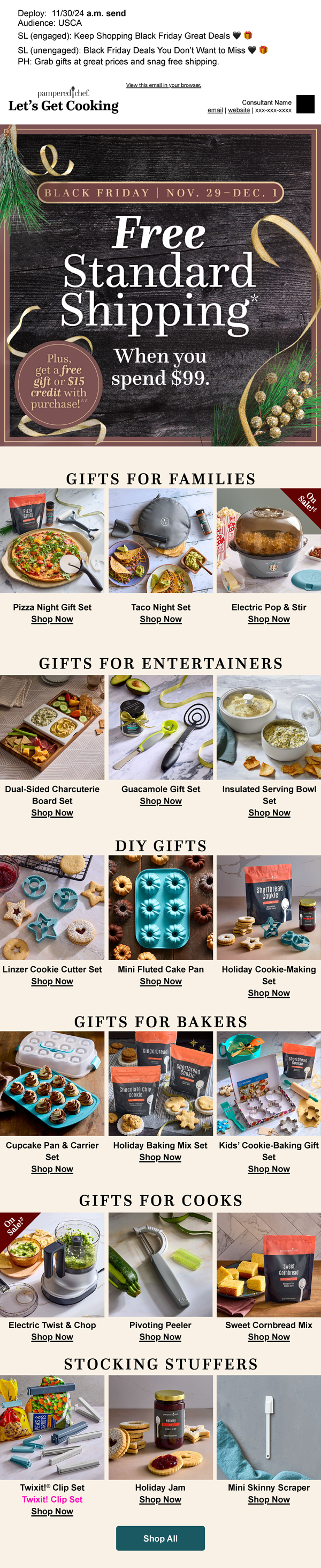
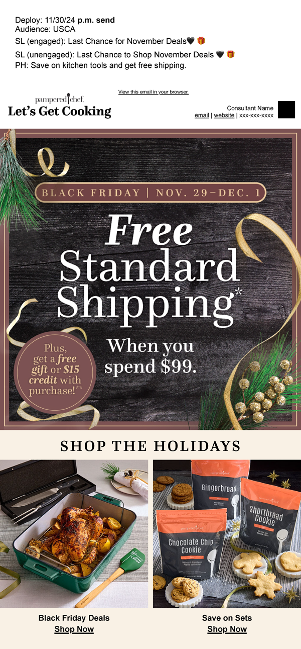
Supporting social cuts ran alongside the homepage takeovers, each pulling from the same visual system — Questa display type, the cream-and-teal palette, and the arched lockup — adapted for square and animated formats.
As July's Summer Sale wrapped, the cadence continued into August with Lunch Box Heroes — a one-week, back-to-school-timed promotion on the Bento Lunch Box and Cut-N-Seal Cup Slicer. The animated banner carries forward the Summer Sale visual system: the same cream background, arched lockup treatment, and tonal palette established in July, now reframed for a kids-and-lunch moment. Continuity like this kept the broader summer campaign feeling like one cohesive arc across multiple flighted promotions.
Pampered Chef's email program ran year-round with multiple touchpoints per month, but the holiday window — Black Friday through Cyber Monday — needed something that felt different. The team wanted urgency and exclusivity without abandoning the warm, food-forward Pampered Chef voice.
As design lead I directed the team on a Holiday Edition system that pushed brand boundaries — moodier color, seasonal texture, and motion graphics — then designed and shipped a connected series across Black Friday, Post-Black Friday, and Cyber Monday touchpoints, including an animated 2023 send that became a template for the following year.
The Holiday Edition identity drove measurable engagement lift across the holiday sequence and gave the brand a recognizable seasonal mode it could return to. Motion sends in particular outperformed static equivalents and became a recurring tool in subsequent campaigns.
Before any email or social asset was designed, I built a holiday look-and-feel system: typography hierarchy with Questa caps and italics, ribbon and pattern treatments on dark wood and marble, a focused four-color palette, and applied examples for hero moments, product grids, and shipping promos. The system meant every send through the Black Friday-Cyber Monday window could ship fast without losing brand cohesion.
Holiday Edition emails and social posts across Black Friday and Cyber Monday touchpoints, experimenting with motion graphics and seasonal texture to create urgency during high-stakes sales periods.
Print at Pampered Chef ranges from the seasonal Season's Best catalog — a flagship piece customers receive every quarter — to product-specific guides that ship inside the box. Each surface needs to feel like the same brand while serving a very different reader: someone browsing recipes versus someone unboxing a new appliance and reaching for instructions.
I refreshed the Season's Best catalog system — larger photography, quieter typography, a cleaner index — and art-directed back-spread features alongside the photo and culinary teams. For the FreezyFun Ultimate Start Guide I designed the piece from scratch, art-directing the cover with the photo team and building every interior spread, with a soft-serve squiggle motif running throughout as a quiet nod to the product itself.
Season's Best now reads quieter and lets the food lead, with the back-of-book feature becoming a recurring high point the team plans around. The FreezyFun guide extended the same design instincts — generous photography, clear hierarchy, a distinctive visual motif — into a brand-new format the company hadn't previously owned in-house.
A brand-new 16-page start guide for the FreezyFun Ultimate Frozen Drink & Soft-Serve Maker, designed from scratch. I art-directed the cover in partnership with the photo team — the four-drink lineup against the green backdrop, sprinkles caught mid-scatter — and built every interior spread: the control-panel anatomy, the preset chart, the one- and two-ingredient mixing tables, and the back-of-book recipes. A soft-serve squiggle motif runs throughout the book as a quiet visual nod to the swirl the machine itself produces.
A minimal refresh of Pampered Chef's Season's Best catalog to reduce visual noise from the previous iteration. I updated the layout with adjustments to typography and increased photography crop sizes, working alongside the photo and culinary teams to art-direct back spread features.
The complete Spring / Summer 2026 edition, designed end to end in partnership with the copywriter, photo team, and culinary team. From cover to back spread, every page reflects the system refresh: bigger photography, tighter type hierarchy, and a calmer overall rhythm.
Season's Best · Spring / Summer 2026 →Pampered Chef's pantry line spanned dozens of SKUs across spice blends, sauces, baking mixes, and seasonal exclusives. Packaging had been built ad-hoc over years, with inconsistent template usage and shifting type hierarchies. Each new launch had to fit somewhere — but the somewhere kept moving.
Working in Adobe Illustrator I established shared templates across product categories — same hierarchy, same nutrition panel rules, same brand zone — then handled each SKU end-to-end: initial design updates, peer review, pre-press setup, and final release to the print vendor.
The template system gave designers and stakeholders a shared starting point, cutting iteration time on new launches and producing a more consistent shelf presence across the line. The bottle labels in particular benefited — the mid- and tall-size systems now scale predictably across new formats.
I took part in establishing and maintaining the product label workflow across Pampered Chef's pantry line, designing new SKUs and refreshing existing ones within a shared template system. Lifestyle direction and individual product shots from across the line.